Effective Spacing Techniques for Modern UI Design
Written on
Understanding Spacing in Design
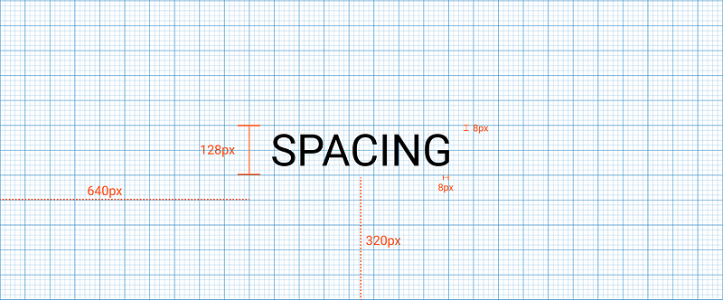
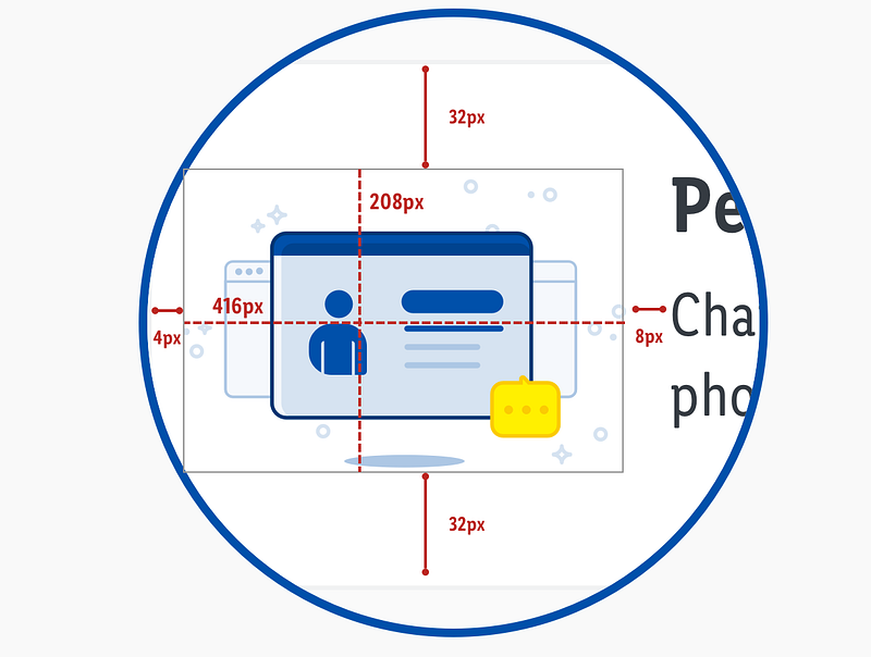
Spacing refers to the horizontal and vertical gaps between components or elements on the screen. It is crucial for creating a balanced and aesthetically pleasing design. The recommended increments for spacing are set at 8 (8, 16, 24, 32, 40, 48, … 128). This guide on spacing is part of a series dedicated to foundational design principles aimed at enhancing digital product development.
The 8px Grid System
The 8px grid system is widely regarded as the most effective for design, as it simplifies the scaling process and ensures consistency throughout. All design elements should align to this 8px grid, applicable across mobile, tablet, and desktop formats.
For spacing and sizing elements on a webpage, utilize increments of 8px. This approach means every defined height, width, margin, or padding should follow this increment. While fluid grids are created through division, fixed grids rely on multiplication. Additionally, typography should align with the 8px baseline grid, ensuring line heights are calculated as multiples of 8.
Occasionally, a 4px grid may be appropriate, particularly for small screens or when creating icons, as it allows for closer spacing between components or text.
Terminology: Dimensions, Padding, and Margins
Spacing involves more detailed considerations (8px) compared to layout structures (12 columns). When positioning elements, it’s essential to follow specific rules.
- Dimensions: These denote the width and height of components. Heights should adhere to the 8px grid, while widths adjust responsively based on the viewport.
- Padding: This is the space within a component, measured in increments of 8px or 4px when necessary.
- Margins: These define the space between components and should also be in increments of 8px or 4px when applicable.
Horizontal Spacing Rhythm
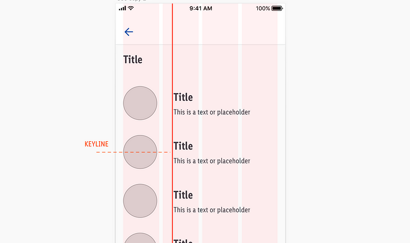
All spacing must align with the 8px increment (8, 16, 24, 32, 40, 48, … 128) to support responsive web design principles. While margins and padding adhere to this rule, dimensions may vary based on layout requirements. To maintain alignment, consider using keylines, which help align components to the 8px grid.

Using Keylines for Alignment
Keylines serve as vertical indicators that assist in positioning elements accurately outside the main layout grid. By adhering to the 8px spacing rule, you can effectively manage the space between components in your layout.
Vertical Spacing Rhythm
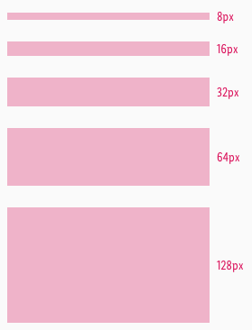
Similar to horizontal spacing, vertical distances should also adhere to the 8px increments. This principle applies to dimensions, margins, and padding. While columns primarily manage horizontal spacing, vertical rhythm relies heavily on spacing practices.
Whenever possible, maintain alignment with the 8px grid, but don’t hesitate to use the 4px baseline for finer adjustments when necessary.
Typography and Spacing
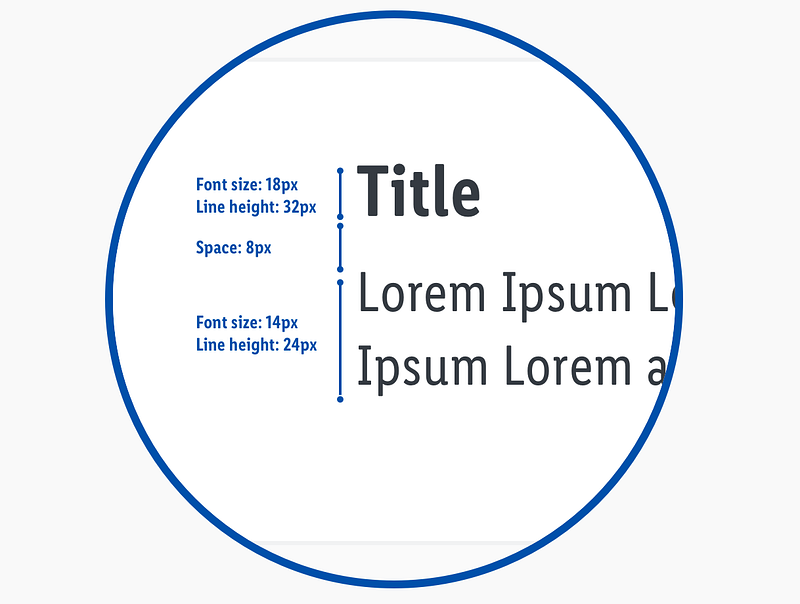
While font sizes may vary, ensuring that line heights are multiples of 8 is crucial. For instance, a paragraph font size of 15 pixels should ideally have a line height of 24 pixels. This adherence to the 8px grid facilitates more cohesive designs.
Similarly, strive for typography to align with a 4px baseline grid, allowing for optimal spacing between lines of text.
Spacing in Icon Design
When designing icons, follow the 8px guideline. Ensure every icon fits within a container that utilizes multiples of 8 (e.g., 24x24). This practice guarantees a consistent layout across your designs, with standard icon sizes typically being 24px by 24px.
Conclusion
This spacing guide aims to boost your confidence in creating UIs more efficiently, ensuring consistency and reducing uncertainty in design decisions. By applying the 8px spacing method, you’ll enhance the overall quality of your designs.
Key Takeaways:
- Maintain vertical and horizontal spacing between components in multiples of 8px; 4px can be used for minimal separations.
- Ensure margins and paddings adhere to 8px increments.
- Typography sizes can vary, but line heights should always be set to multiples of 8px (e.g., Font: 15px; Line-height: 24px).
- Icons should reside in containers that are multiples of 8px.
For further insights, consider exploring well-documented resources from various organizations. Here are a few of my top picks:
Feel free to reach out with any questions—I’m always open to discussions. Thank you for reading! I’m Oriol, a product designer dedicated to solving problems through research and design. Connect with me on LinkedIn or visit my portfolio website.
Chapter 2: Enhancing Spacing with Video Tutorials
Incorporating video resources can enhance your understanding of spacing in design.
The first video, "How To Get The Perfect Spacing In Web Design," provides valuable insights into achieving optimal spacing in your layouts.
The second video, "The Perfect Spacing Framework in UI Design | Figma Tutorial," walks you through utilizing Figma for effective spacing strategies.