Calculating Market Size KPI in Power BI: A Comprehensive Guide
Written on
Understanding Market Size and Its Importance
Calculating market size is crucial for businesses that want to grasp their potential customer base and revenue possibilities. By assessing the total demand for a product or service within a certain market, organizations can make strategic decisions regarding marketing, budgeting, and growth opportunities.
Key Aspects of Market Size:
- Significance: Estimating market size enables businesses to understand potential customer reach and revenue prospects.
- Decision-Making: Reliable market size calculations guide marketing tactics, budget distribution, and growth strategies.
- Guide: This article offers a clear and straightforward method for accurately estimating market size, assisting businesses in navigating their market effectively.
In this guide, I will walk you through the process of creating a card visual in Power BI to showcase the market size for a specific brand.
At the conclusion, we will have a visual like this one:
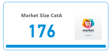
Market Size for Category A KPI
Building the KPI Card for Market Size
We will cover the following steps:
- Understanding the KPI table
- DAX for Market Share
- Creating and Formatting the KPI Card
Happy learning!

1. Understanding the KPI Table
We will utilize the following table for our KPI analysis:
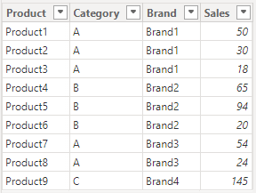
Key Insights:
- Category A:
- Brand1 has three products with sales of 50, 30, and 18.
- Brand3 has two products with sales of 54 and 24.
- Category B: Brand2 has three products with sales of 65, 94, and 20.
- Category C: Brand4 has one product with a sales figure of 145.
Summary:
- Brand1 and Brand3 compete within Category A.
- Brand2 leads Category B with three products.
- Brand4 is the only brand in Category C, achieving high sales.
This table provides insights into sales distribution across various products, categories, and brands, offering a comprehensive overview of market performance.
Breakdown of the DAX Formula:
- CALCULATE: Evaluates an expression in a modified filter context, allowing for specific adjustments based on the data.
- SUM(Market_Share[Sales]): Computes the total sales from the Sales column in the Market_Share table.
- ALLEXCEPT: Removes all filters except for the Category column, ensuring that the calculation considers all sales within the same category.
- Market_Share[Category] = “A”: Filters the data to include only rows where the category is "A."
Overall, this DAX formula sums sales figures for Category A by aggregating all relevant products while ignoring other applied filters.

For Category A, the sales values of 98 and 78 yield a total of 176, which represents the market size.
3. Creating and Formatting the KPI Card
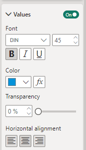
To create the KPI card, select the card visual from Visualizations and input the IRR data. Navigate to Format visual, then in Visual, go to Callout values. Here, expand the options, choose a color of your preference (I selected #0492D9), adjust the horizontal alignment, and set the font to bold.
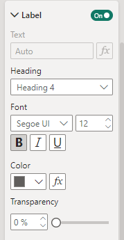
Next, expand Label settings, choose a color (I opted for #605E5C), and make the font bold.
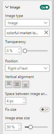
Then, expand Image settings, select your preferred image, position it to the right of the text, disable fixed size, and set the image size to 30%.
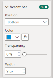
After that, expand Cards, enable the Accent bar, and for color, select #0492D9. Set the position to Bottom and the width to 9px. Finally, navigate to Format visual, enable Visual border, set the color to #0492D9, and adjust rounded corners to 10% with a width of 1px.
With these steps completed, we have successfully created the KPI card.

Understanding and Creating Internal Rate of Return (IRR) KPI in Power BI
Power BI serves as a versatile platform, enabling users to connect to various data sources, transform and model data, and create insightful visualizations.
The first video titled "KPI Visual Ideas in Power BI" presents innovative approaches to visualizing KPIs in Power BI, offering valuable insights for effective data representation.
The second video, "How to Transform a LINE CHART into an Insightful KPI VISUAL in Power BI," demonstrates how to convert traditional line charts into impactful KPI visuals, enhancing data interpretation.
Thank you for your attention!
Follow me or subscribe to receive all my Power BI articles!
Shashanka Shekhar - Medium
Read writing from Shashanka Shekhar on Medium. Contributor for Microsoft Power BI. I enjoy data analysis and visualization.
Don’t forget to subscribe to:
- Power BI Publication
- Power BI Newsletter
- Join our Power BI community
- Power BI Masterclass
References:
